
Happy New Year Everyone!
It’s not just a new year, of course. It’s a new decade! And many of you have reached out to ask our team what is ahead in terms of real estate.
In the coming months we’ll talk about trends in the market, trends in financing, and trends in design. And, as always, we’re excited to share our knowledge and years of experience with you.
Many of our clients have commented that their houses look a little sad now that the holiday decorations have come down.
We hear you! This is a “grey” time of year in the Pacific Northwest, and it’s often the time of year we start dreaming about a face-lift or pick-me-up for our homes.
It’s also the time of year that color institutions and paint companies release their color trends for the year. Let’s take a look at what might be ahead.
2020 COLOR PREDICTIONS
Every company has a slightly different take on what colors will be “hot” in 2020. If you’re thinking of selling this year, it might make sense to add these colors to your home. Whether you’re painting, choosing fabric, or adding art and accessories, the colors you choose can make a big difference.
If you like to be on top of the latest or generally “avant-garde”, you may want to immediately implement some of the colors design experts are currently recommending:
DEEP AND DRAMATIC GREENS – the popularity of this color has been inspired by the huge trend toward indoor plants. All greens, but particularly the darker greens (forest green, olive greens, and deep khaki greens) are getting rave reviews.
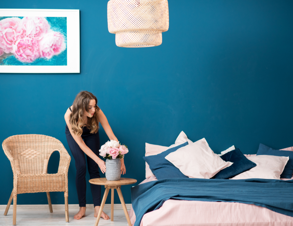
ELECTRIC BLUES – Blue has long been the most popular color in the United States, with more muted blues (think navy blues and denim blues) being a consistently popular choice. Many designers are incorporating the drama of electric blues to energize home design.
PLUMMY PURPLES – The warmth and depth of this color comes from combining violet, lilac, and black. There’s a richness to this color that’s quite extraordinary.
RICH ORANGES – For the past couple of years, a very bright orange was a popular color. That shade has been toned down slightly, and the newer shades of apricot orange, terracotta, and cinnamon have risen in popularity. In keeping with the softening of tone, we’re seeing these shades paired with browns and blacks.
EARTHEN BROWNS – Some designers are predicting that warm brown tones will replace gray as the go-to interior color!
CLASSIC BLUE – Pantone’s color of the year is “classic blue.” This is a shade the company likens to “the sky at dusk.” Pantone said they chose the color because it offers “reassurance, confidence, and connection that people may be searching for in an uncertain global milieu.” Again, this ties back to that feeling of warmth mentioned in discussing the other shades above.
HOW TO SUCCESFULLY ADD A POP OF COLOR TO ANY SPACE
Maybe you’re not ready to paint your walls forest green. Or a plummy purple.
A rich orange room may be too much of a commitment for you. We get it!
Enter the “pop of color”. If you’ve watched any design show on TV this is probably a term you’ve heard over and over.
Great ways to add a pop of color include:
- Painting a single accent color on either one wall, or on a door.
- Adding a colorful appliance to your kitchen. While ovens and refrigerators do come in fun colors, you don’t have to make such a big commitment. Stand mixers, coffeemakers, and other small appliances are available in eye-catching colors.
- Incorporating a colorful area rug.
- Changing the towels in your bathrooms or kitchen.
- Accessorizing with new throw pillows and other small design elements such as vases or books.
AND IF YOU WANT TO PAINT …
There’s no doubt about it – a fresh coat of paint can go a long way toward revitalizing your home. If you’re like most people, you’re probably unsure about the type of paint to use in certain areas. Take a look at the chart below for a fast-and-easy answer to the “what kind of paint should I use” question.
| ceiling flat | flat | matte | eggshell or velvet | satin or low lustre | gloss or high gloss | |
| ceilings | ü | ü | ||||
| walls | ü | ü | ü | |||
| high-traffic areas | ü | ü | ||||
| doors + trim | ü | ü | ||||
Although we know it’s tempting to use the same paint on your walls, ceiling, and trim, if you do that you will end up with an odd-looking room!
Eggshell (or velvet, as some paint companies call it), is the most popular wall paint. It’s scrubbable, and that’s a huge selling point. But paint that on your ceiling and you’ll be forever distracted by the shine.
Keep an eye on matte-finish paints! Matte is quickly growing in popularity and may be a good choice if you like the no-shine look of flat paint, but don’t like the high level of maintenance that comes with it.
As always, we welcome your comments and feedback. Want to talk more about colors coming down the pike in 2020? Let’s talk! Need a referral to a great painter? We’ve got you covered. Or if you simply want to chat about the 2020 real estate market, we’re your #1 source for reliable information.